Close
Close

Carlsberg
Elevating an icon
Services
- Branding
- Visual Identity
- Design System
Scroll
The Context
As with many global brands, over time the idiosyncrasies across cultures and teams create fragmentation. Carlsberg wanted an elevated and modern design system that would stay connected and consistent across their expanding global markets.
The Opportunity
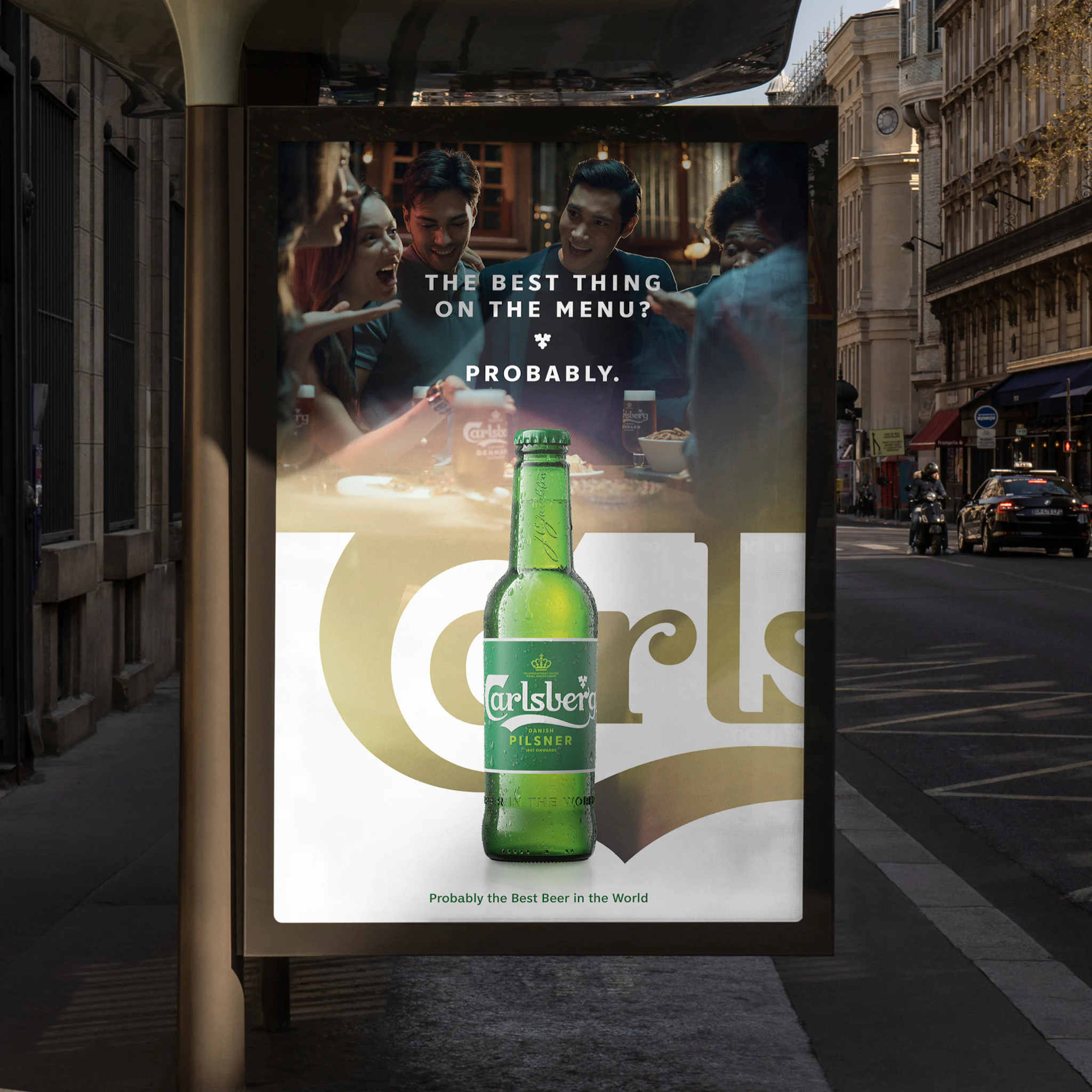
Our solution harnesses the visual power of an under-exploited existing brand asset. The Carlsberg logo is the storied, intricate and beautiful centre piece for the brand wherever you are in the world. The new system creates a much bigger and more integral role for it.
From scaling it to supergraphic proportions increasing awareness and interest, to using it as 'content container' – an invitation into Carslberg’s world – the stage is set for their next chapter.
From scaling it to supergraphic proportions increasing awareness and interest, to using it as 'content container' – an invitation into Carslberg’s world – the stage is set for their next chapter.

Every detail is considered and codified to ensure sights are set on a truly consistent and well adopted system.
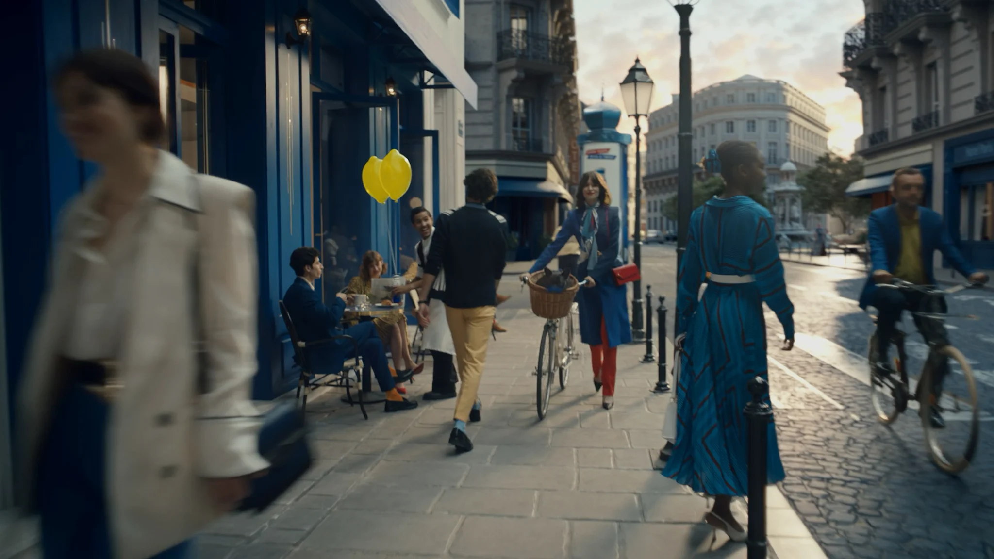
Defining a motion scheme for the brand for the first time, was a priority to utilise the full power of modern channels.
“The trick is to realise when you have something so iconic that even when you extrude, morph, heavily crop or drag through a hedge backwards – it still garners recognition. We felt the logomark was under-exploited when demoted to a conventional “premium” lower third sign-off position”
00%


