
Transcending Trends: The design moves worth evolving in 2024
Our Head of Design, Tom Munckton, talks the top 5 design trends for 2024.
I’ve spent the majority of my career trying to avoid “trends”. I would always argue that good brand design should seek not to follow trends, but instead create their own.
But in 2024, I concede that the sheer number of new brands created and rebrands breathing new life into existing – added to the ever increasing number of platforms dedicated to pushing out polished case studies of it all – it’s becoming easier to spot nuanced trends and the impact they create.
In some ways trends can tell us something about how far brands will go to visually excite and connect with their audiences. They make a new ‘normal’ of often more extreme ideas - pushing open new doorways for designers. Whilst we must not seek to replicate them, we can use them as markers to push beyond.
So here’s a few to look for – spanning all aspects that make up a brand identity toolkit. From brand photography attitude through to typography techniques.
1. Photography trend: Seeing life from different perspectives
Noticing a lot of brand photography is shooting through a hyperreal lens. Less of the saccharine real-life lifestyle and more from ever more weird and wonderful angles and perspectives. No doubt connected to the assent of Midjourney – if executed well this approach has the capacity to captivate and break through the sea of same.
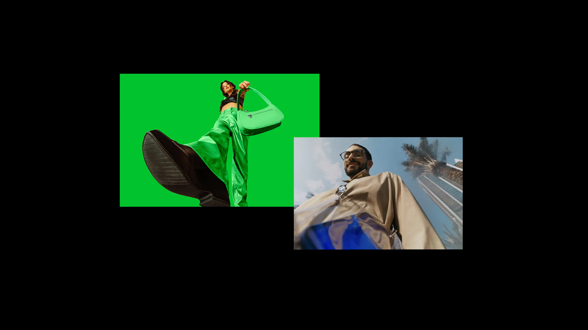
From left: Bolt by Koto, Yango by How&How
2. Multidimensional messaging
The messaging equivalent in some ways of the above – the warping, extruding, abstracting of type – almost as if gouging out of static billboards and hitting you in the face in motion. Often it wraps in and around the perimeters of media – defying the laws of conventional layout. It looks exciting – but requires careful codification to ensure it can be executed consistently across bigger brand systems.
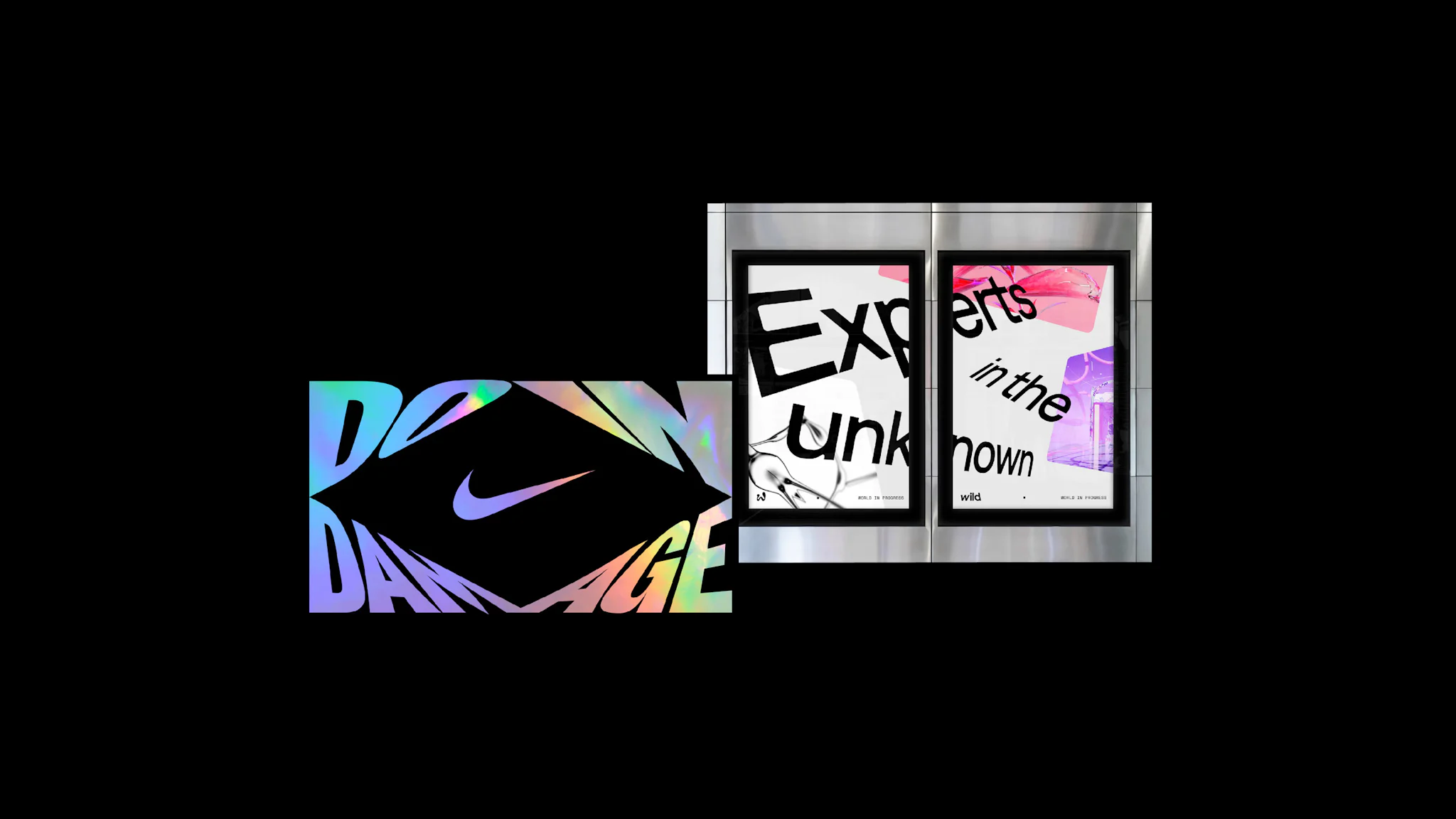
From left: Nikediamond by SantosDilone, Wild by Justified Studio
3. Replacing letterforms with wibbly wobbly ones
A self contained act of wild emotion amidst miles and miles of san serif typography.
Often these are indicative of ‘challenger brands’ – visually and inherently breaking the conventions of bother design and their categories. The flourishes are often arresting and beautifully formed – but we’re definitely in the danger zone of syndication now.
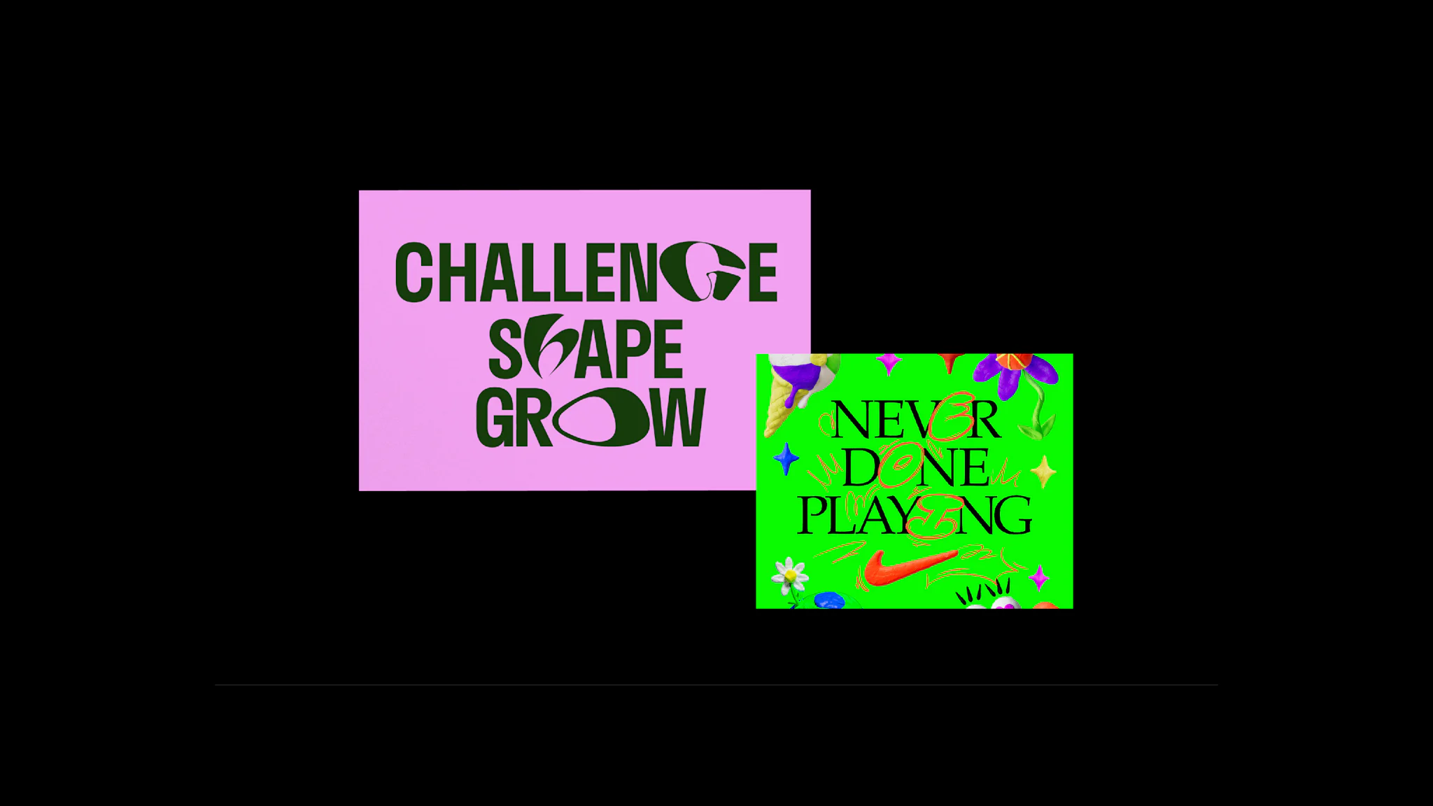
From left: Nike Never Done by Burn & Broad, YoungCapital NEXT by Verve
4. Nostalgic filters
This one is more nuanced and has been cooking for a while. The sharp clean-cut vectors have been replaced with the analogue imperfections of blurs, noise and even dot screen textures. The effects observe perhaps a leaning amidst seamless technology towards the sensorial and a more human warmth. We spent years cleaning them away and now perhaps we missed them.
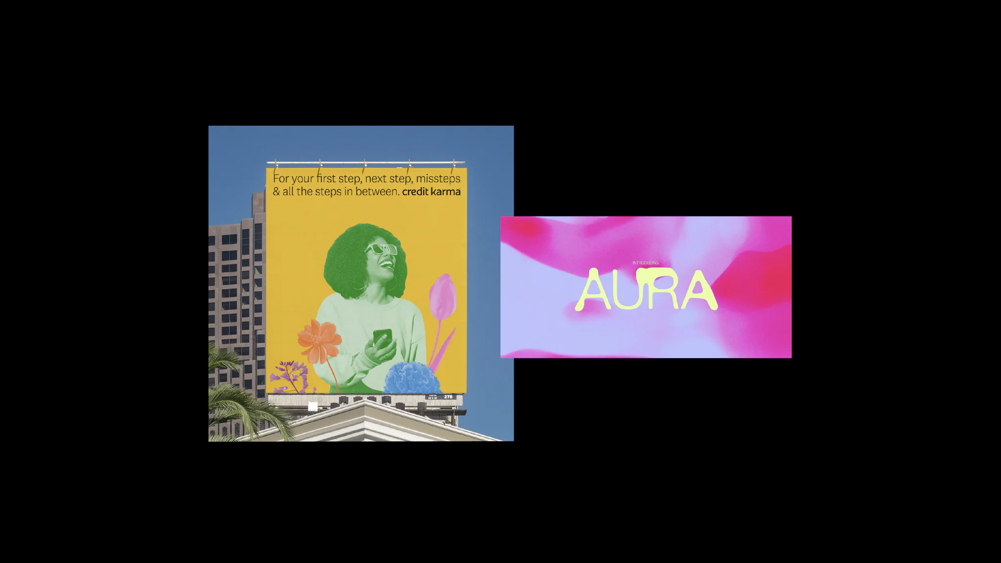
From left: CreditKarma by Collins, feeld by MadeThought
5. Wonky boxes
Perhaps we’re tired of straight edges? Radius corners are boring us? Either way wonky boxes are on the rise. Image boxes are cut into, distorted heading off into all sorts of angles. There’s plenty of room left in further exploration of the wonky box world to create a more unique feel for a brand right across brand touchpoints.
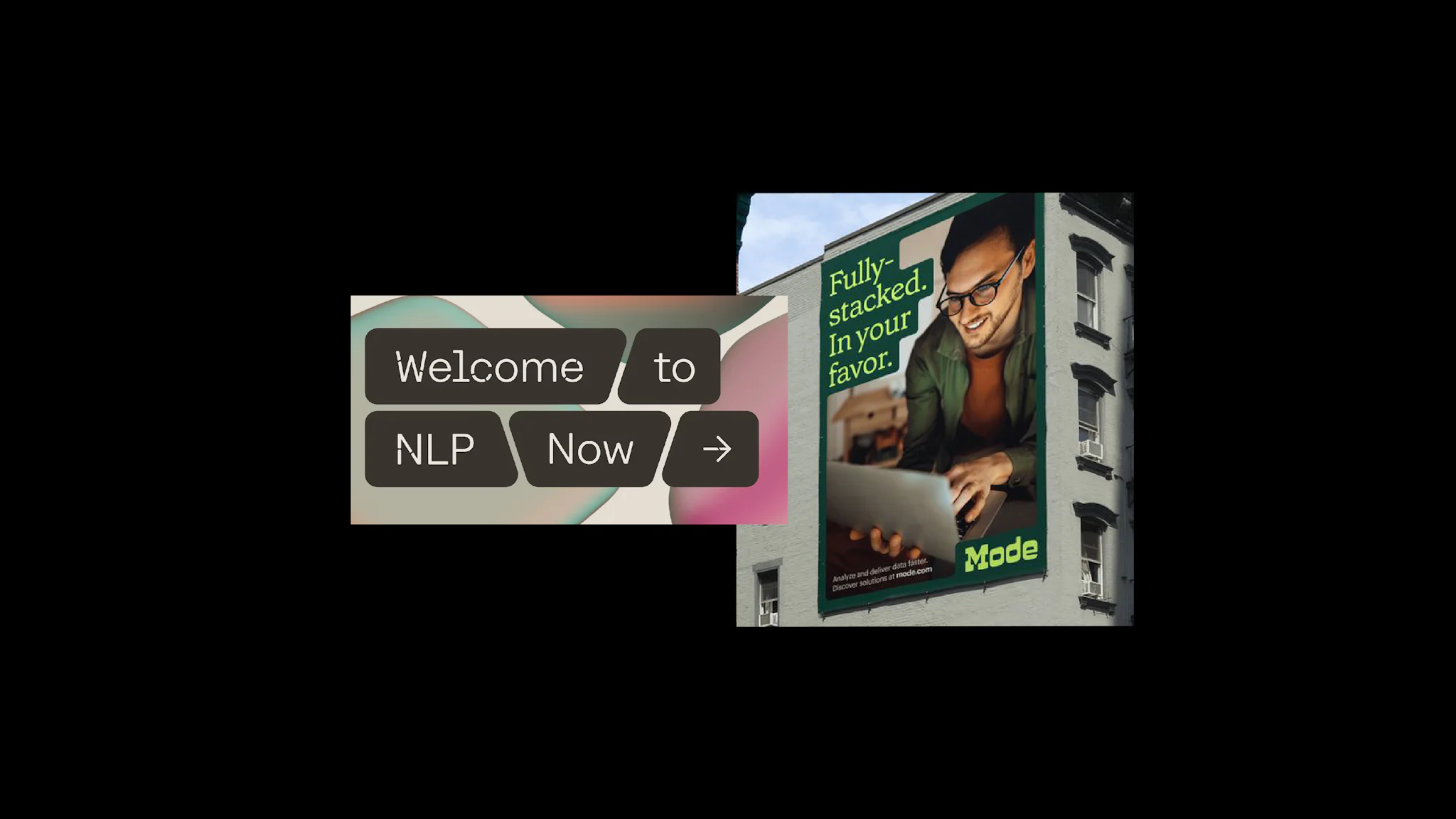
From left: Cohere by Pentagram, mode by Gretel NY
Find this interesting? Click here for our Top 5 Social Media Tips & Trends for 2024.
More Suggested Articles
Sign up to hear
more from us.
We'll add you to the mailing list so you can read our
latest news, views and cunning ideas.


